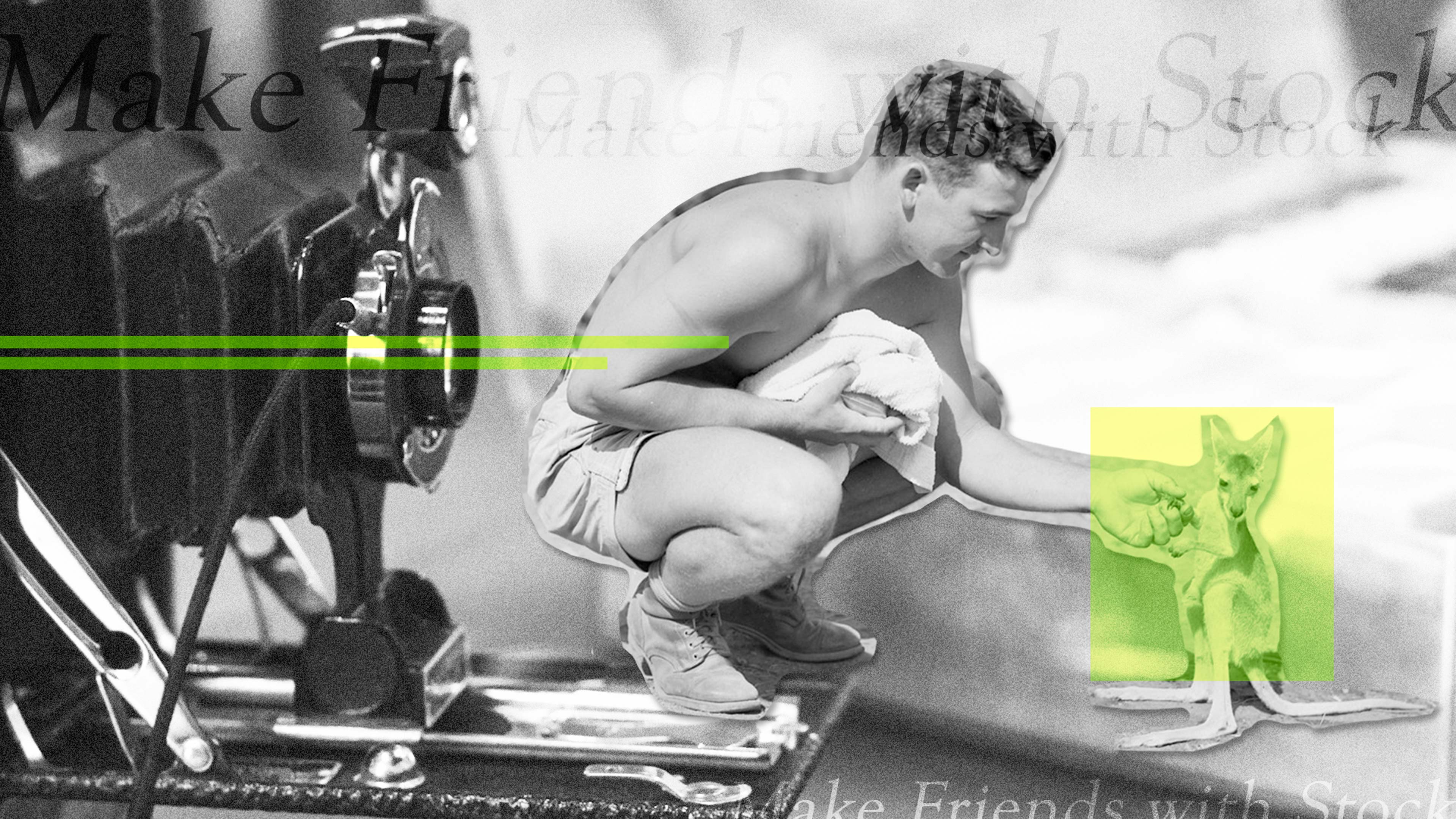
Make Stock Imagery Your Friend, Not Your Enemy: 5 Tips on How to See the Best in Stock Photography
July 28, 2016
It’s true, there are some really atrocious stock images that exist in marketing. Because of this, the word “stock” has left a sour taste in everyone’s collective mouth. But I’m here to convince you that not all stock is appalling. Would it be ideal to use custom graphics, illustrations, or to do your own photoshoot? Of course! However, time and available resources can be prohibitive, and you may have no other choice but to use stock.
See below for tips on how to improve your approach to selecting stock imagery.
- Cut the cheese. The number one hallmark of an awful stock image is the cheese-factor. If the photo features people looking very posed or directed, the image comes off as fake and disingenuous. Candid photos look much more authentic. Avoid images where the models are over-acting. Do you want to see bored expressions? No, but nobody is THIS happy in the workplace…nobody.

lenetstan, Business team celebrating a triumph with arms up: Shutterstock.
Avoid handshakes, high-fives, and for the love of all that is holy, avoid photos of groups jumping in the air with their fists raised.
Andrey Popov, Portrait of successful business team with arms raised standing over white background: Shutterstock. - Tailor your queries. The best way to find the perfect image is to search using the right terms. It may sound self-explanatory, but searching for a generic, abstract concept might not be enough. Think about a specific scene or visual metaphor that would represent your concept. For example, if I’m looking for a photo to go along with a tip sheet on unifying software platforms to track your travel expenses, I might look for a photo of merging streets or converging railroad tracks. Some vendors like iStock even have curated lightboxes full of the best and most unique images on a particular topic in their collection.
- Cut the clichés. Puzzle pieces, a chess board, binary code flying out of a lock and arrows hitting a bullseye – all of these are squares on the BINGO card of stock clichés. You’ve seen these images time and time again representing concepts you would find in your everyday corporate PowerPoint. Photos like these are tired, uninventive and should be avoided. Every graphic or image that you use should be a representation of your brand; a brand that is unique and creative. Your visual demonstrations should reflect thought and style, they should not be a regurgitation of clichés and clip art.
- Be smart with illustrations. Stock illustrations and vectors can be very dangerous in the wrong hands. They are essentially stylistic approaches that are frozen in time, which means that they can become outdated far faster than a photo (see below).

Andrea Danti, A key connected to some circuits and an android hand reaching for it. Digital illustration..: Shutterstock.
Stock illustrations should really only be used if you have the ability to manipulate and alter them, or if they are combined with another approach or asset. - Be resourceful. Not a designer? Don’t have any of those fancy Adobe programs? There are a number of free/open source programs that will allow you to enhance and edit your photo to make it unique. Try interesting crops, color filters, or even collage! Here is a list of some of the most popular tools: pixlr.com, picmonkey.com, and canva.com.
Consider yourself empowered! You don’t need to be an artist or designer to be a good visual communicator.